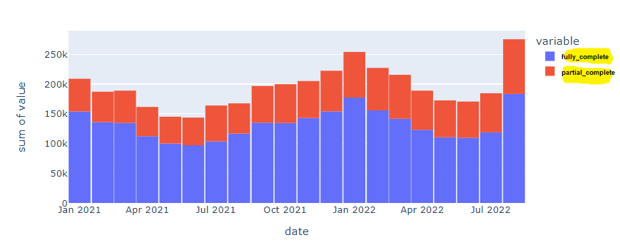
I had been querying account data from a prodcopy postgres database. It worked but it was pretty slow. My org is moving all of that data into Snowflake, which seems a lot better, but requires me updating some of my go-to Python scripts.
Pandas has a built-in function read_sql but it's worth using psycopg2 or sqlalchemy to gain some additional functions. I had been using psycopg2 but all of the Snowflake documentation uses sqlalchemy, so I'm trying something new. If you see anything off with the syntax, let me know so I can update it!
Creating a dataframe
In this walk-through, we'll create the chart below. I'm going to gloss over the details of setting up the connection because it is well documented elsewhere. The key takeaway, which I found surprisingly difficult to find examples of online, is how to run SQL scripts without having to escape all of the special characters.

Pip install whatever you don't have, but here's what you'll need to import.
# needed to create the connection and run SQL
from snowflake.sqlalchemy import URL
from sqlalchemy import create_engine

# needed to wrangle some data and create a chart
import pandas as pd
import numpy as np
import plotly.graph_objects as go
import plotly.express as px
import plotly
We'll create a connection to the database. I've obfuscated my credentials but this part is pretty well documented in Snowflake's official docs.
url = URL(
    user='username',
    password='password!',
    account='accountlocation',
    database='database1',
    schema='schema1'
)

engine = create_engine(url)
connection = engine.connect()
I couldn't find any examples that do this next part without writing SQL in the notebook. We need to create a dataframe and most of the documentation uses a snowflake connector function with a really basic SQL query. When I started using multi-line queries, escaping the special characters and getting the formatting just right was really tedious.
This approach seems to work well because you can write and test your SQL in a Snowflake worksheet and then just copy and paste it into a file in the projects root folder. No special formatting necessary!
query = open('goal_completion.sql', 'r')
df = pd.read_sql(query.read(), connection)
df.head()
And here's the SQL script in that helper file, which I was able to write and troubleshoot in the Snowflake worksheet.
select
date_trunc('month', creation_date) as date,
  a.goal_completion,
  sum(case when a.complete = true then 1 else 0 end) as fully_complete,
  sum(case when a.complete = false then 1 else 0 end) as partial_complete,
  count(a.complete) as total,
  sum(case when a.complete = true then 1 else 0 end)*1.0 / count(a.complete) as rate
  from "schema1" a
  WHERE 1=1
and a.creation_date >= '2021-01-01 00:00:00'
and a.creation_date < '2022-09-01 00:00:00'
group by date, a.goal_completion
order by date
To this point, your code should look like this and you now have a dataframe!
# needed to create the connection and run SQL
from snowflake.sqlalchemy import URL
from sqlalchemy import create_engine

# needed to wrangle some data and create a chart
import pandas as pd
import numpy as np
import plotly.graph_objects as go
import plotly.express as px
import plotly

# creating connection
url = URL(
    user='username',
    password='password!',
    account='accountlocation',
    database='database1',
    schema='schema1'
)

engine = create_engine(url)
connection = engine.connect()

#running helper file and creating dataframe
query = open('goal_completion.sql', 'r')
df = pd.read_sql(query.read(), connection)
df.head()
That outputs a dataframe with these columns:
date | goal_completion | fuly complete | partial_complete | total | rate
I'm using a long data format where goal_completion contains all of the different types of goals a user could complete. For the first visualization, I'm just going to look at total goal completions and not do any further segmentation.
Using your dataframe to create visualizations
This is the fun part and there's so much excellent documentation out there, but we can use plotly express to whip up that visual at the beginning of the post.
fig = px.histogram(df, x='date', y=["fully_complete", "partial_complete"], histfunc='sum')
fig.update_layout(bargap=0.02)
fig.show()