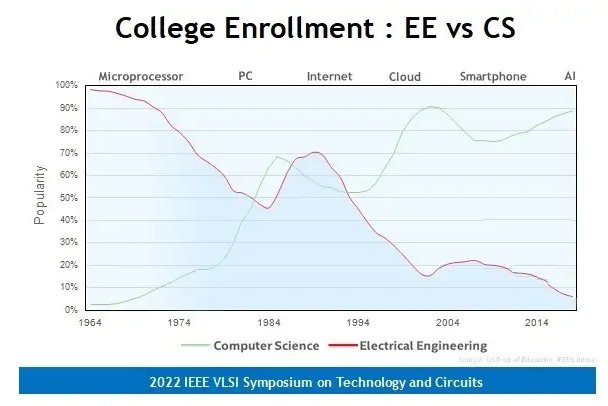
This was inspired by seeing a startling comparison between electrical engineering and computer science enrollments. And, anecdotally I've interviewed more than a handful of electrical engineers for software engineering roles. Eventually I'd like to overlay outcomes data to show the change of salaries between different majors.

This is a first pass to try and familiarize myself with the data. I started wrangling IPEDS data using the Urban Institute's Data Explorer API (which is fantastic, btw). This code is neither tidy nor performant but it gets the job done. I think if I were to keep fiddling with this, I would set it up to export the data as json blobs and do all of the data visualization on this site using ChartJS, which I already use for some calculator widgets. It's really hard to get mobile responsive charts using Python libs. The 11ty pagination feature + Netlify CMS is perfectly suited for batching out this kind of content. I might try to do it over the long, dark winter months.
Anyways, here's the chart I created. My chart starts about where the inspiration ended. I was surprised to see a drop in the rolled up CIP code (110000—Computer and information sciences and support services). I looked into it, and there's actually more people enrolling in those degrees than ever, but it has insanely high drop outs. This analysis is showing the degrees conferred.
Here's the code. It's pretty nasty and looping through that many pagination API pages takes way too long - like 40 seconds per CIP code. If I wanted to take this further I would need to re-write it.
import pandas as pd
import requests

total_results = []
#computer science
cip_code = '110000'

#create the df. I think it would be better to start with an empty df and handle all of the data in the loop
url ='https://educationdata.urban.org/api/v1/college-university/ipeds/completions-cip-2/2009/?cipcode=' + str(cip_code)
response = requests.get(url)
data = response.json()

total_results = total_results + data['results']

# While data['next'] isn't empty, download the next page
while data['next'] is not None:
    response = requests.get(data['next'])
    data = response.json()
    # Store the current page of results
    total_results = total_results + data['results']


df = pd.DataFrame (total_results, columns = ['unitid','year','fips','cipcode','award_level','majornum','race','sex','awards'])
new_df = df.groupby(['cipcode','award_level']).agg({'majornum': "sum"})
new_df.rename(columns = {'majornum':'2009'}, inplace = True)


def add_years():
    for i in range(10,20):
        global new_df
        global cip_code
        total_results = []
        url ='https://educationdata.urban.org/api/v1/college-university/ipeds/completions-cip-2/' + '20'+ str(i) + '/?cipcode=' + str(cip_code)
        response = requests.get(url)
        data = response.json()

        total_results = total_results + data['results']

        # While data['next'] isn't empty, download the next page
        while data['next'] is not None:
            response = requests.get(data['next'])
            data = response.json()
            # Store the current page of results
            total_results = total_results + data['results']

        df = pd.DataFrame (total_results, columns = ['unitid','year','fips','cipcode','award_level','majornum','race','sex','awards'])
        temp_df = df.groupby(['cipcode','award_level']).agg({'majornum': "sum"})
        temp_df.rename(columns = {'majornum':'20'+str(i)}, inplace = True)
        new_df = new_df.merge(temp_df, on='award_level', how='left')
    return new_df

new_df = add_years()

#in this case, it is faster to just transpose the df to create a visual. usually it'd probably be better to unpivot / melt it
df_transposed = new_df.T
df_transposed.rename(columns={1: 'Award of less than one academic year', 2: 'Award of less than two academic years',3: 'Award of at least one but less than two academic years',4: 'Associate degree',5: 'Award of at least one but less than four academic years',6: 'Award of at least two but less than four academic years',7: 'Bachelors degree',8: 'Postbaccalaureate or post-masters certificate',9: 'Masters degree',20: 'Doctors degree',21: 'First-professional degree',22: 'Doctors degree, research',23: 'Doctors degree, practice',24: 'Doctors degree, other'},inplace=True)
And then, dropping some columns that make the chart messy plotting it out.
df_transposed.drop(columns=['Award of less than one academic year','Award of at least one but less than two academic years','Award of at least two but less than four academic years','Postbaccalaureate or post-masters certificate', 'Doctors degree, research','Doctors degree, practice','Doctors degree, other'],inplace=True)


#import plotly.express as px

fig = px.line(df_transposed)

fig.update_layout(legend=dict(
    orientation="h",
    itemwidth=70,
    yanchor="bottom",
    y=1.02,
    xanchor="right",
    x=1
))

fig.show()